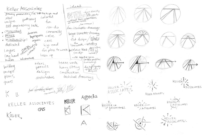
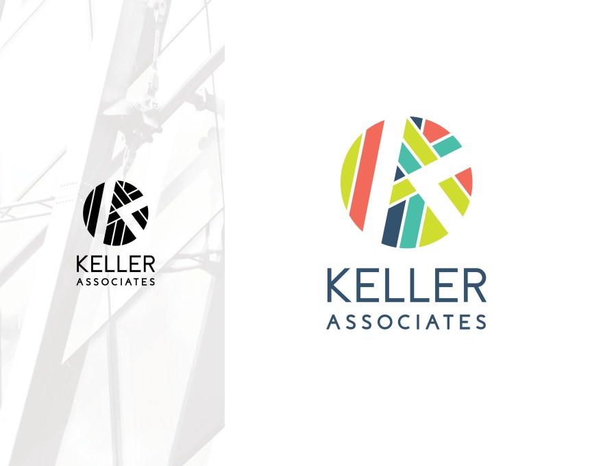
Carew Co. logo redesign project for Keller Associates, an engineering firm who wanted a new brand with energetic colors that would be unique and different from other firms. This logo I created was a runner up, but was very well received.
Keller builds off of its associates (stacked typography) and each color represents a type of service – water, buildings, etc. I played on the idea of intersection and connection, with K & A both represented through the different angles.